There is, of course, some element of character design involved in any figurative illustration. For characters that will be used multiple times, from different angles and in different situations however, special attention needs to be paid to aspects such as recognisability, consistency, distinctness, etc. I’ve had lots of experience of this sort of thing.


Sample vector-style character designs for ELT educational title. My line-drawing & colour style was eventually chosen for this project as these samples were considered too different in appearance to the illustrations I’d done for earlier books in the series.


Cover Image for Dog Eat Robot magazine. Originally produced in black & white – this version done as a personal piece.


Poster for HIT Productions Australian tour of Peter Quilter’s ‘Just The Ticket’.

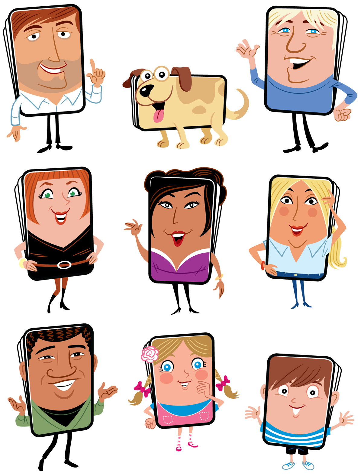
Early version of characters designed for family card game packaging. We subsequently went down a different route entirely with this project but I still quite like these unused drawings.
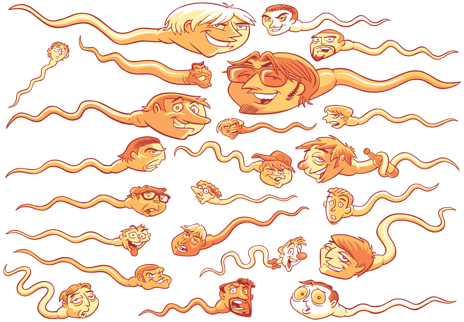
Anthropomorphised sperm (!), for an article on male infidelity in Handbook Magazine.

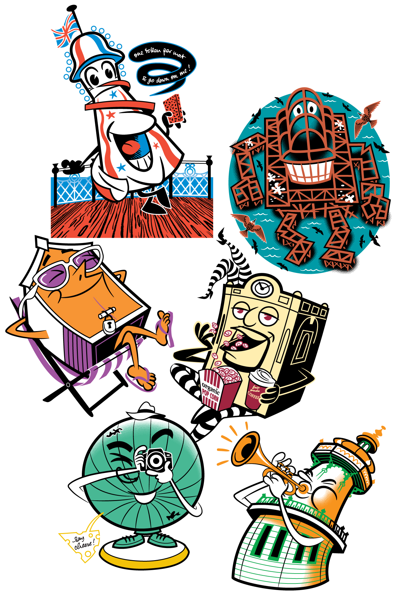
Bricons; characters based on well-known Brighton landmarks for set of postcards.

Simple coconut character. That was pretty much the brief, if I remember correctly. It never went anywhere.
 Comedy bird character. These are two of many situations this character was depicted in as part of an educational book project and demonstrate the recognisability/consistency point made earlier.
