Earlier this year, in preparation for the opening of their second restaurant in Guildford, the Chilli Pickle had a branding makeover, overseen by Design LSM. The idea was to formalise the visual and environmental elements of the restaurant to enable brand consistency to be maintained across multiple locations. Up until this point, their visual identity had evolved in a piecemeal, organic manner, but had nevertheless proved very successful, so an important consideration during the project was not to lose sight of the already established strengths and spirit of the brand amid all the innovative thinking.
Thankfully, it was decided that my illustrations should continue to feature in some way, so I was quite closely involved in the whole collaborative process, which I found extremely interesting. You can see the eventual results of the project via ingenious high-res virtual walk-throughs on the Chilli Pickle website:
The following four poster designs appear prominently in both restaurants. Their deliberately mis-registered halftone appearance and overlapping placement on the walls is a self-conscious nod to the colourfully anarchic street art found across India, of which we were all big fans.
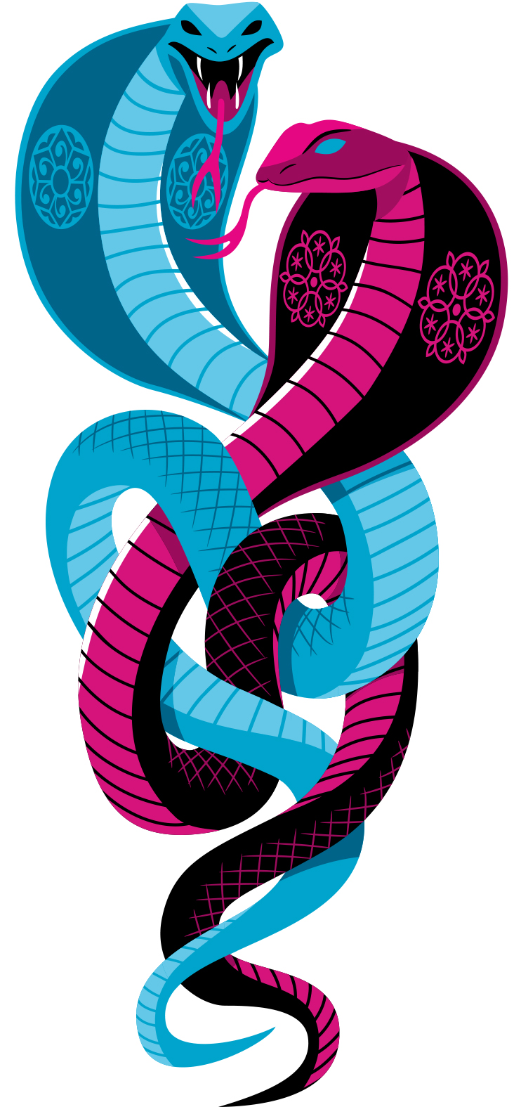
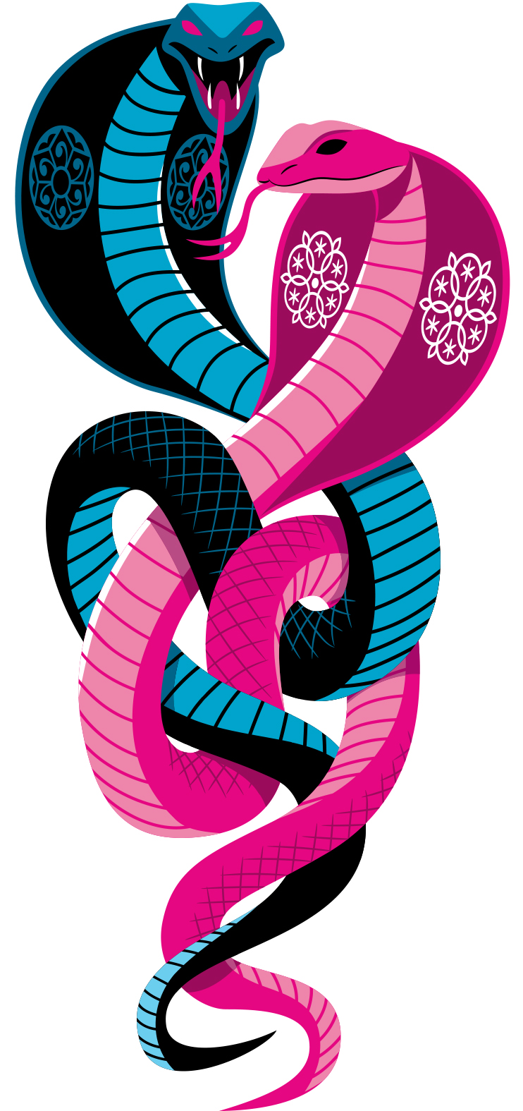
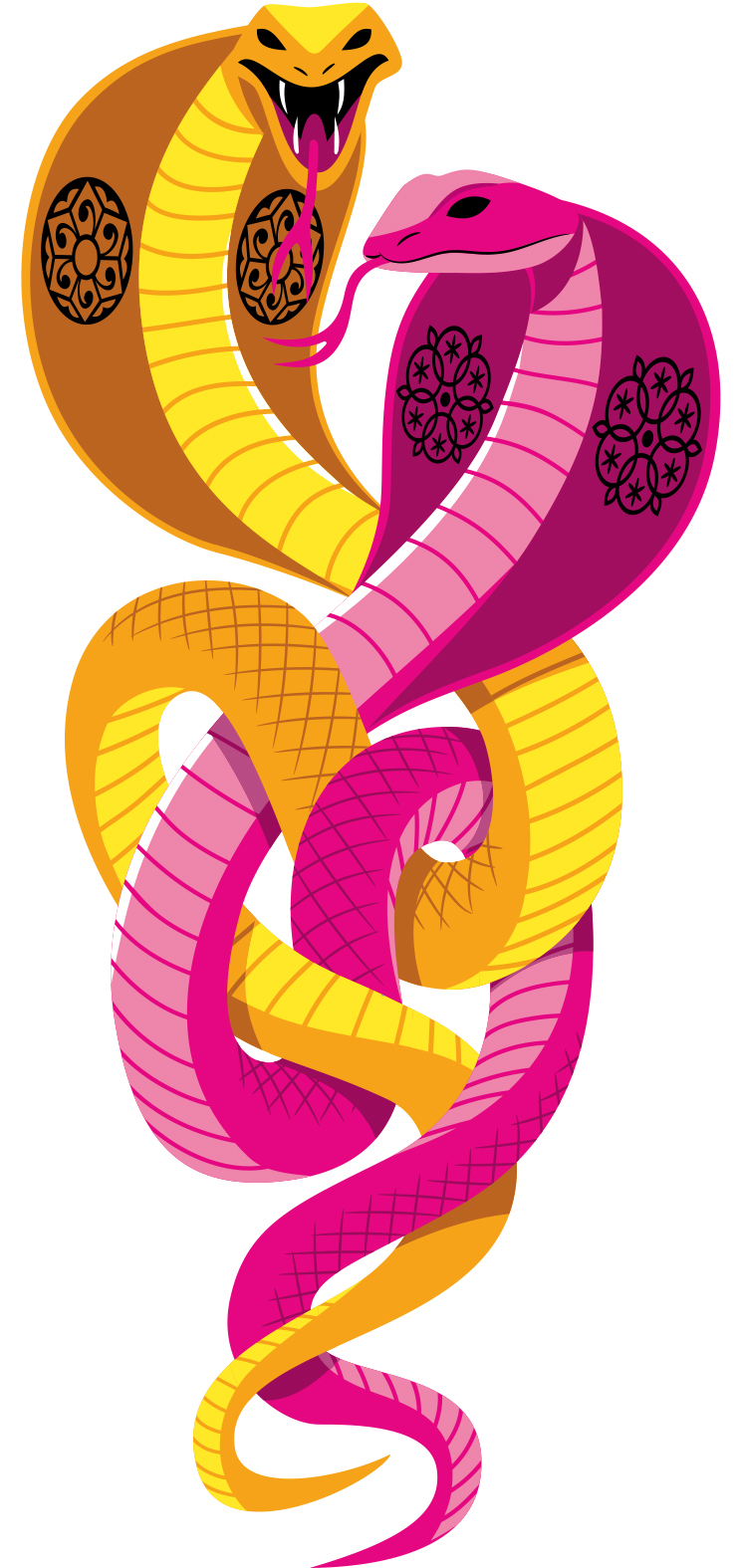
Below are pre-distressed versions of the poster illustrations , showing some of the many alternative colour combinations tried out, together with a few unused images that were hurriedly ditched when it was discovered that another Indian restaurant chain prominently featured tigers in their branding.


